Who Knew Fonts Could Be "Woke"?
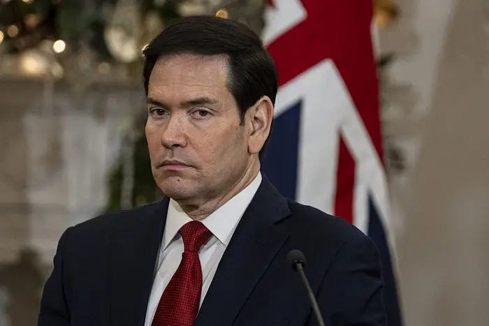
Marco Rubio has saved western civilization from a dangerous typeface
The current war on wokeness is leaving no stone unturned. Any idea, object, or design decision that can be remotely framed as “woke” is now a potential threat to Western civilization.
Wokeness, for you and me, is simply the idea that we acknowledge other human beings exist, that they experience the world differently than we do, and that empathy might help us build a society that works for more than a handful of people.
A dangerous concept, apparently.
And who knew one of the stealth invaders out to destroy everything was…the Calibri font?
No, I’m not making this up.
The Great Font Panic of 2025
Back in 2023, the State Department switched its standard font from Times New Roman to Calibri. The reason was accessibility. Calibri is easier to read for people with low vision. It’s better for screen readers. It helps people with dyslexia. In other words, it was a small, bureaucratic choice aimed at making life easier for people who need a little help.
But accessibility is “woke” now.
So under the new administration, Secretary of State Marco Rubio has ordered a full rollback. Calibri is gone. Times New Roman is back. The stated reason is that Calibri is “informal” and “clashes with the department seal.” But the memo also calls it a relic of “DEI programming,” which is the tipoff.
This isn’t about fonts. This is about making a point. This, like everything else, is about owning the libs.
The point is: if a policy was adopted because it helped marginalized people—even in a modest, practical way—it has to go. Even if the change costs nothing. Even if it hurts no one. Even if it simply makes documents easier for visually impaired Americans to read.
In the war against wokeness, even your letterhead must comply.
When Everything Is Wokeness, Nothing Is Safe
Once you start down this path, the targets multiply quickly. If Calibri is a threat, what isn’t?
Ramps for people in wheelchairs? Woke.
Handrails? Woke.
Stairway lighting so people don’t break their necks? Woke.
Automatic doors when your hands are full? Extremely woke.
Peanut-allergy warnings that keep kids alive? Off-the-charts wokeness.
Closed captions on public screens? Woke.
Seatbelts and airbags? Probably socialist.
Fire escapes? Woke urban design gone wild.
Warning labels telling you not to drink bleach? Absolute tyranny.
Once you’ve decided that empathy itself is the enemy, the ordinary tools we use to help each other navigate the world become suspicious. The stakes get inflated. A font isn’t just a font anymore. A ramp isn’t just a ramp. A warning label isn’t just a warning label. Everything becomes part of a battle for civilization.
And the easiest way to signal your loyalty is to stop caring about whether something helps people.
The Real Tell
That’s the part they won’t say out loud: accessibility itself has become political. Not because it’s expensive, or intrusive, or controversial. But because it acknowledges that people who aren’t you exist and matter.
If the government can’t even tolerate a slightly more readable font—one designed to help Americans with visual impairments—what does that say about the next ten policy debates coming down the line?
Maybe the real fear isn’t that Calibri will destroy the republic. Maybe the fear is that empathy will rebuild it.
And That’s the Punchline
For all the talk about tradition and professionalism, Times New Roman didn’t become the “official” font of American strength. It just happened to be what Microsoft shipped with Windows for a long time.
But here we are. Fighting culture wars at the level of typefaces. Treating readability as a partisan threat. Declaring fonts loyal or disloyal to the state.
If you had “sans-serif typography” on your list of national security threats, congratulations. You win today’s prize.
And if you didn’t, don’t worry. At the rate things are going, everything will be a threat soon enough.


